

Golance
Freelance Marketplace
Overview
goLance.com has become a dynamic player in the freelance industry, currently supporting a vibrant community of 600,000 users. The platform's ongoing development reflects its commitment to adapting and growing in a competitive market.
As part of the product design team, my contributions were focused on developing new features, such as advanced financial reporting and a refined company hierarchy system within the platform.
Through comprehensive user research, market analysis, and usability testing, these features were carefully crafted to align with our users' needs, showcasing goLance.com's dedication to innovation and user-centric design.
My Role
Lead Designer — Research, User Review & testing, Interaction & visual Design
Team
Designers (3)
BA (2)
PM (2)
Front-end (4)
Back-end (6)
QA (2)
Timeline
19 months
Preview
Highlights


Research
What is this platform and how does one use it?
The optimization process of goLance.com began with an analysis of competitors such as Upwork, Fiverr, and Freelancer.com to understand our market position. Thanks to the presence of active users on the platform, we had a unique opportunity to gather feedback not from abstract potential customers but from real people who encountered problems and were willing to share their insights.
Then, we focused on the most important thing - the feedback from our users. We analyzed everything: from usability testing results to analytical data. This helped us to accurately understand the needs and desires of our users.
Aged Aesthetics: The platform's outdated visual style lacked appeal, potentially deterring user engagement.
Restrictive Profile Creation: No ability to create separate profiles for freelancers, agencies, and companies
Lack of Financial Tracking Tools: There were no dedicated features for tracking transactions and financial activities.
Complex Navigation: The user interface was intricate and bewildering, posing challenges for new users.
Data Presentation Issues: Ineffective tables and graphs led to difficulties in interpreting key information, hindering efficient decision-making.
Research Findings
Integration of Company Monitoring Functions:
We plan to develop features for effective management of freelancers within the company, including employee supervision, financial reporting, offers, and workflow management.
Simplification of User Experience and Navigation:
We are undertaking a radical rethinking of the user interface to create an intuitive, accessible, and user-friendly navigation system.
Challenges
Speed of Implementation
Responding to customer feedback, we've encountered dissatisfaction with the current system's mechanisms, illogical interface, and a lack of integrated company management. Clients are struggling with task creation, while freelancers face difficulties due to the lack of clarity in task assignments.
Quality of Solutions
With a variety of possible functions to integrate, it is crucial to identify the most significant ones that will contribute to increasing user work efficiency.
The Process
Timeline

Research
Data Collection & Competitive Analysis
Brainstorm
Ideation, Sketching, Concept Development
Prototype
User testing, Feedback
Design
Usability Testing, post-design review
Feedback
So, what do the users have to say?

Rajesh K.
Why is it so complicated to get financial reports? I have to spend a lot of time just to find the information I need. The interface is too convoluted, and I often find myself getting lost in it. I was expecting a more intuitive experience from your product.

Ethan R.
Working with your company management tool has become a real nightmare. I can't effectively track my freelancers' tasks, and keep running into errors when adding them or changing their roles. Please improve this.

Elena H.
Terrible user experience when dealing with contracts and offers! I can't quickly find the documents I need, everything is lost among a bunch of unnecessary tabs. The system needs to be simpler and more straightforward.

Alex J.
I expected much more from your freelancer management system. There are too many difficulties, especially when it comes to coordinating work between different departments. Constant glitches and insufficient support from the technical service only exacerbate the situation.

Anjali B.
I'm really disappointed with the new freelancer management system! It's so hard to understand who among my staff is working on which project. Also, I constantly face issues while trying to add new freelancers into the system. Something needs to change!

RESEARCH RESULTS
Based on an in-depth market analysis, user feedback from our platform and support channels, as well as business needs, we have identified crucial tasks for detailed elaboration
Structure
Path to Implementation
After all the tests and feedback, we began the development of the company management page structure. The main page should become a central hub in the form of a dashboard, which will provide monitoring of the latest changes, analysis of reports, and management of freelancers.
Centralized Control: The dashboard will serve as the nerve center, offering instant add-on information features and direct action buttons, streamlining the user journey from decision to execution with seamless transitions to relevant forms and pages.
Comprehensive Insight: Navigating through the intuitive tabs will provide a holistic view of the company's operations, from team dynamics to financial health, enabling users to glean extensive knowledge for informed decision-making.
Enhanced Accessibility: Designed for optimal user engagement, the page ensures effortless access to all vital company management functions, fostering an environment where strategic oversight is both a priority and a pleasure.
CHALLENGE
It is essential to implement comprehensive company management tools that allow every client to control their freelancers and tasks.
Structure
Company page structure
Design
Usability Review and Design
After meticulous structuring, accommodating numerous revisions, new client proposals, and enhancements, as well as refining nuances identified through usability testing of prototypes, we achieved the final design. This design effectively fulfills all user needs in managing their company and freelancers, providing comprehensive functionality for reporting and other key aspects of management.
Dashboard overview
Dashboard is designed for streamlined company management, offering quick team, finance, and contract oversight. Its benefits include simplified workflows and enhanced decision-making efficiency.


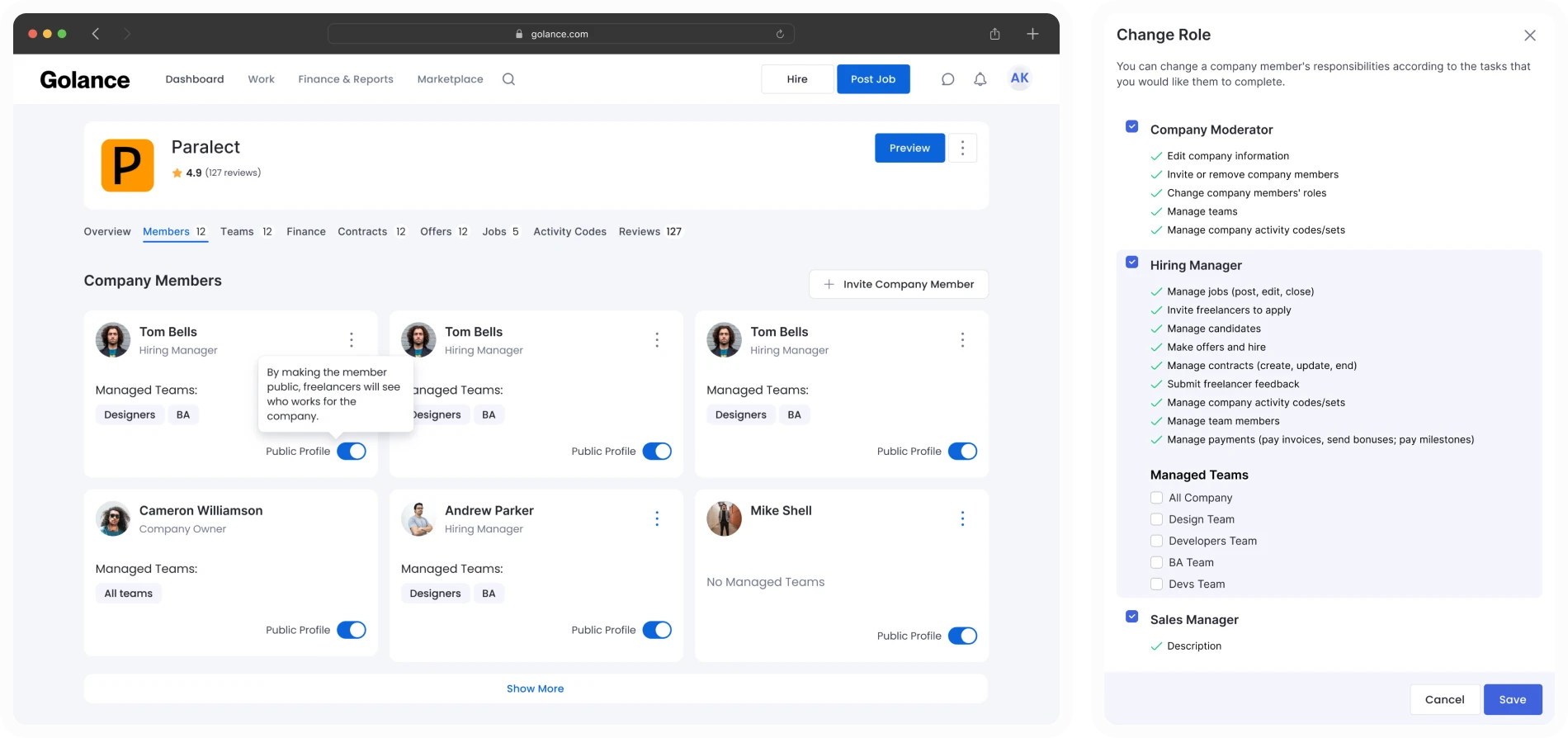
Members
This screen enables company administrators to efficiently organize and customize team member roles, providing a clear structure of team responsibilities. The advantages include personalized workflow customization and enhanced resource management efficiency.

Teams
Grouping contractors into teams by profession or project , streamlining management and coordination. It offers the capability to assign team managers specific oversight, enhancing the efficiency of project administration and team collaboration.


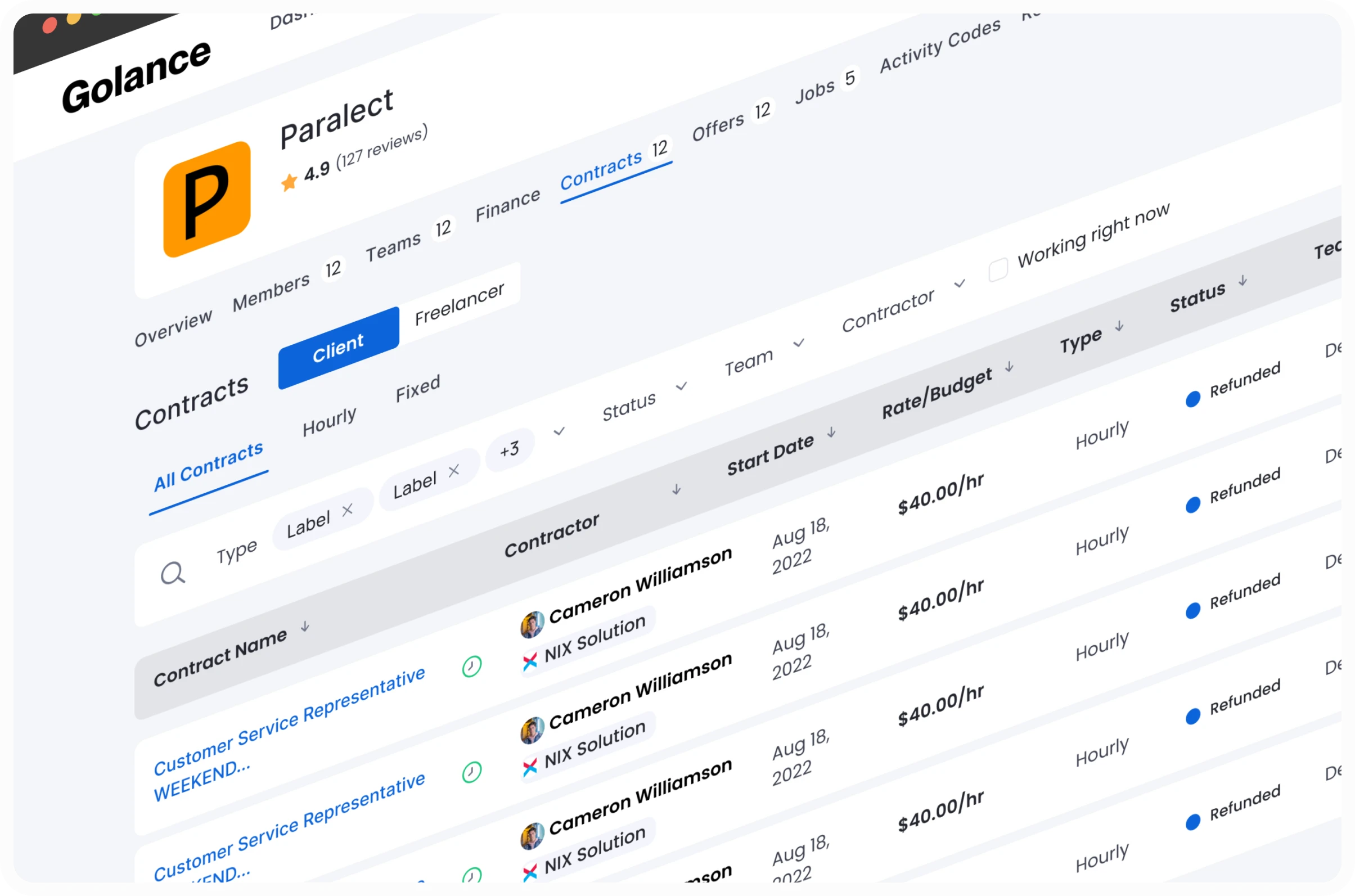
Contracts and Jobs
Showcase tabular views for contracts and job postings, facilitating organized management of corporate operations and workflows.

Contracts table with key details such as contract name, contractor, start date, budget, and status, simplifying the navigation and management of current contractual commitments.
Job postings table detailing job title, category, posting date, and status, streamlining the process of publishing and monitoring job listings on the platform.

Finance
Financial management dashboard, showcasing company balance, billing methods, and a transaction log. It provides a snapshot of financial health and facilitates operations like transfers and payment method reviews, with the added capability to export transaction details for analysis.


Other tabs and modals
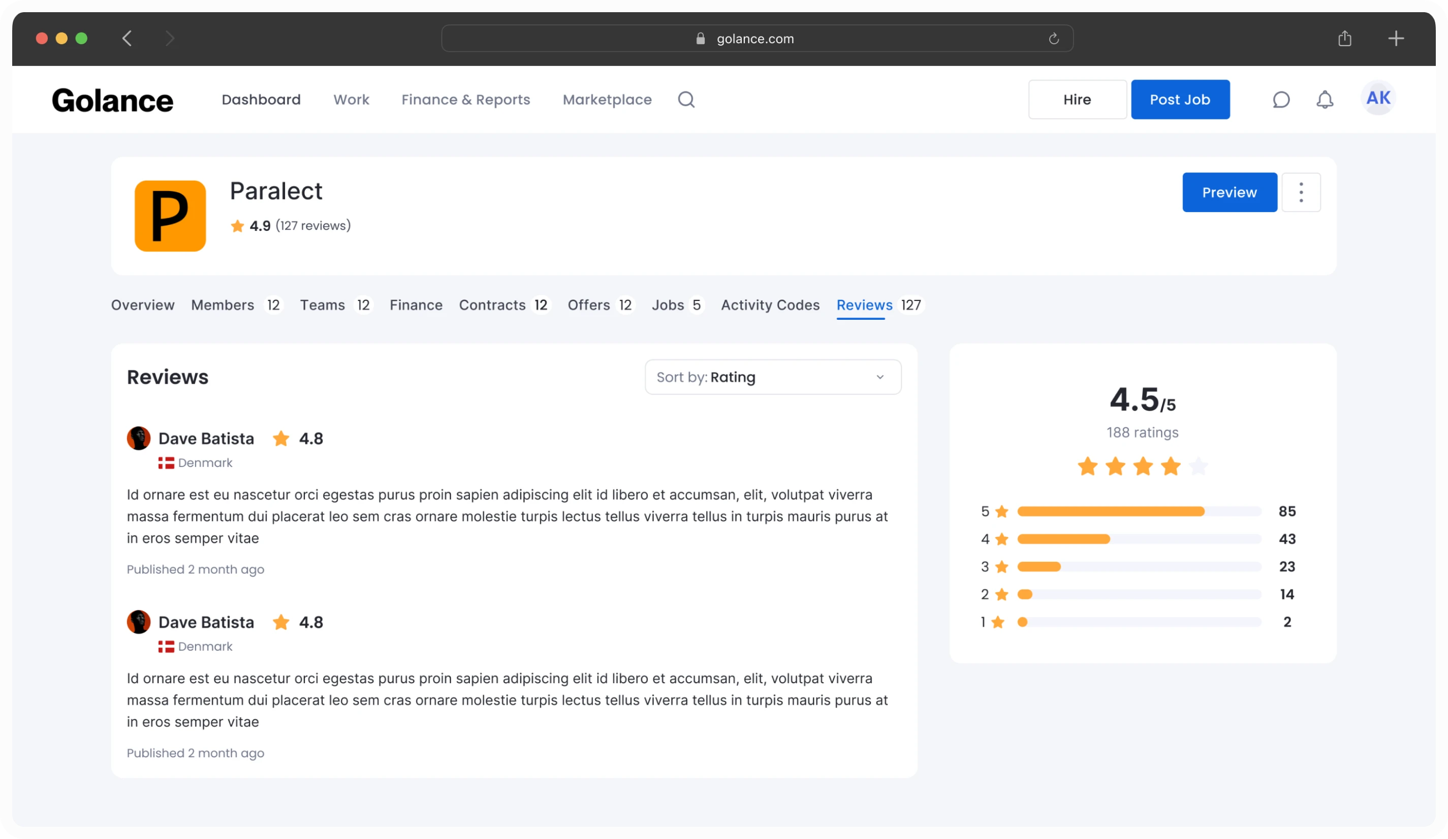
These screens display tabs for managing job offers, activity organization, and user feedback within a company. The "Offers" tab simplifies the sending and tracking of job proposals, "Activity Codes" aid in structuring work processes, and "Reviews" gather user feedback for satisfaction assessment.


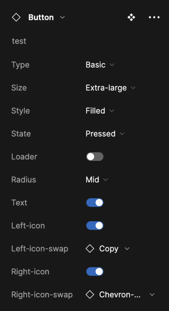
Third point. Design system
What about Design Guidlines?
We developed a cohesive design system from scratch, encompassing a suite of versatile components suitable for our project and potentially across the company's products. The system, exemplified by our button designs, balances aesthetic appeal with functional integrity. Components are designed to be intuitive across various states—default, hover, disabled, focus, pressed, and loader—and maintain visual consistency through standardized use of text labels, icons, and containers.


Navigation
Navigation design
Of course, we recognized the importance of navigation on the platform. For users, it's critical not only to have new features but also to comfortably use the existing ones. Realizing that our current navigation was becoming outdated, we conducted a thorough analysis of competitors and user feedback. Following comprehensive testing and research, we implemented significant improvements to the platform's navigation.
Rajesh K.
Finding some pages on the platform is tough. It takes too many clicks to get where I need to be.
Elena H.
Is there a way to simplify navigation to specific features? The current process is quite cumbersome.
Alex J.
Could there be a more straightforward route to detailed reports? Navigating there is currently quite puzzling.
Ethan R.
Where can I easily find the data I'm looking for? The reporting layout is confusing.


1
Non-Intuitive Navigation: Difficulty in understanding and using the navigation menu effectively.
2
Unclear Usage: Lack of clarity on how to use various features and tools on the platform.
3
Duplicate Links: Presence of redundant or duplicate links, leading to confusion.
4
Similar Functionality Across Pages: Multiple pages with overlapping or similar functions, causing user confusion.
Improvments
Structure? Structure!
When developing the new menu for the freelance platform, the design was guided by a research study, focusing on the following key principles
Intuitive Navigation: The menu is intuitively divided into logical segments , which facilitates easy navigation and understanding for users, streamlining the search for specific sections or tools.
Organized Content: Related sub-items are grouped together within each main segment to maintain orderliness. For example, all financial matters are clustered, enhancing the efficiency of information retrieval.
Action Orientation: Menu item titles are action-based or informative (such as "View Contracts," "Manage Payment Options"), aimed at directing users toward specific actions or information.
Simplicity and Functionality: The menu presents a balanced approach by not appearing cluttered, indicating a pursuit of minimalism for user convenience while retaining all necessary functionalities.
User-Centric Design: There is a clear emphasis on the two main user types of the platform - clients and freelancers, with sections reflecting their specific interests and needs (e.g., "Client Profile" and "Freelancer Dashboard").
Strategic Placement: Critical functions like finance management and job access are centrally located, making them more readily accessible to users.

Retrospective
Retrospective
FINAL RESULTS
Thanks to these enhancements, user engagement with the platform has begun to surge, fueled by a marked improvement in usability, the introduction of innovative features, and distinct advantages over competing products.
We can extract a number of project takeaways.
Of course, these updates represent just a glimpse of the product's evolution, given that over 2000 unique frames have been created, each with its own set of functionalities and features.
Importance of User Feedback
Understanding user needs was crucial. This influenced design decisions, making the platform more user-friendly and intuitive.
Value of Data-Driven Design
Utilizing data effectively guided the redesign process, ensuring that changes were impactful and met user requirements.
Teamwork and Collaboration
The project's success was significantly aided by effective collaboration across different teams, combining various skills and perspectives.
Iterative Improvement
The project demonstrated the importance of continuous improvement and adaptation based on user feedback and changing market needs.


Let’s create digital magic together and conquer the design world!
Artyom Komlev. All right reserved. 2024